Creative Inspiration Monthly – #9
Now that pubs, bars & restaurants are in full swing, we thought we’d take a look at some impressive branding that’s making us want to go out for food & drinks…
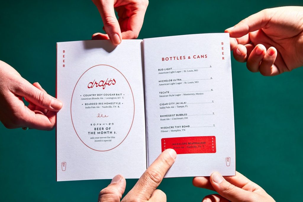
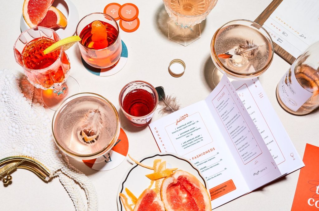
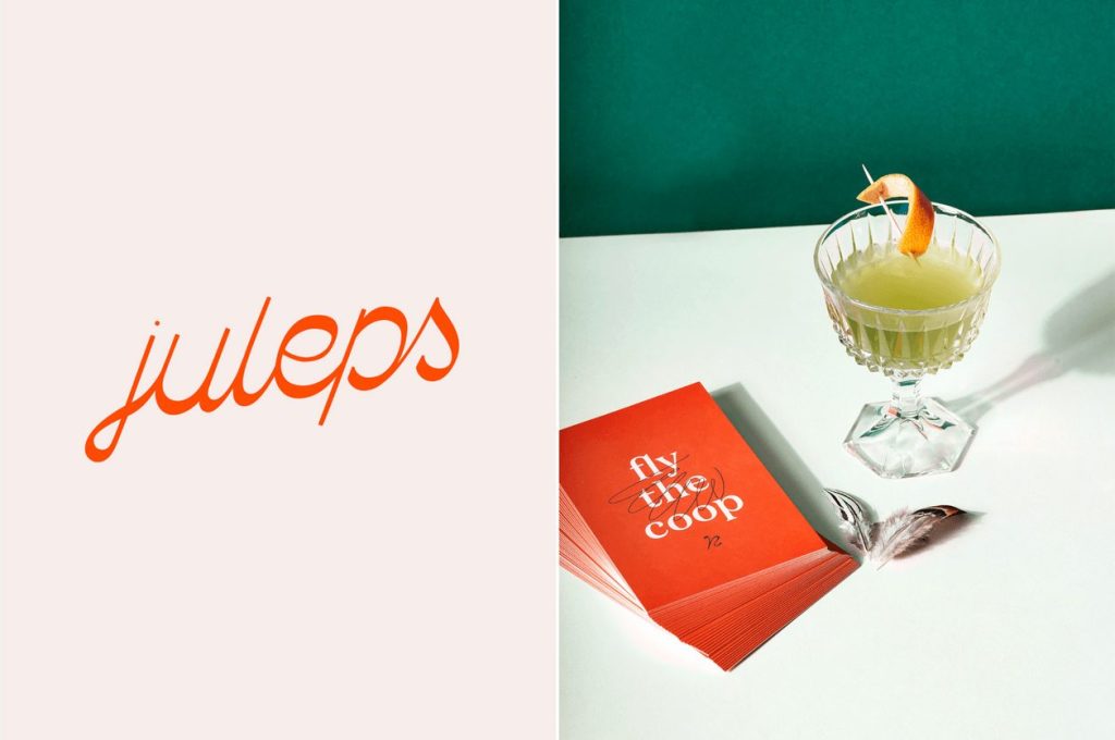
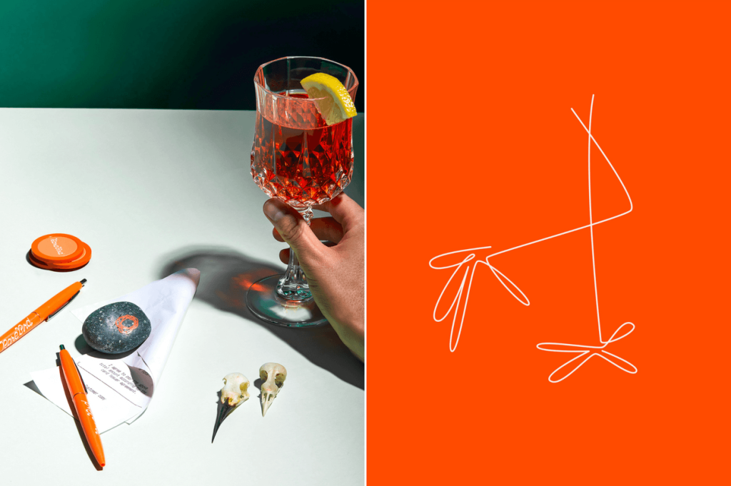
Rare Bird
First up is Rare Bird, a super cool rooftop bar in a few locations in the US. It’s quirky & bold, and would be perfect for the gram. The guys behind the branding, PDA Studios, have used some interesting typography and line illustrations to tie the brand together to make it modern & unique.
“This relaxed rooftop bar plays host to the lovely and the wild. Tufted with personality and uncaged spirits, this brand, like its patrons, are one of a kind.”
It’s a shame we can’t hop on a flight to the US right now…
See the full case study here
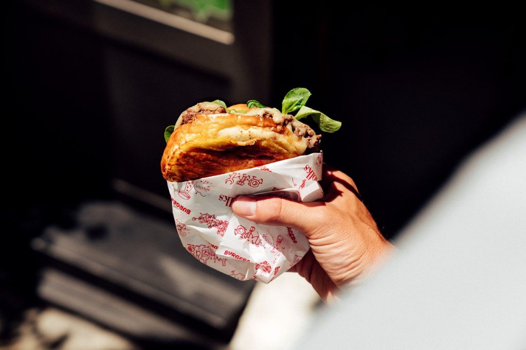
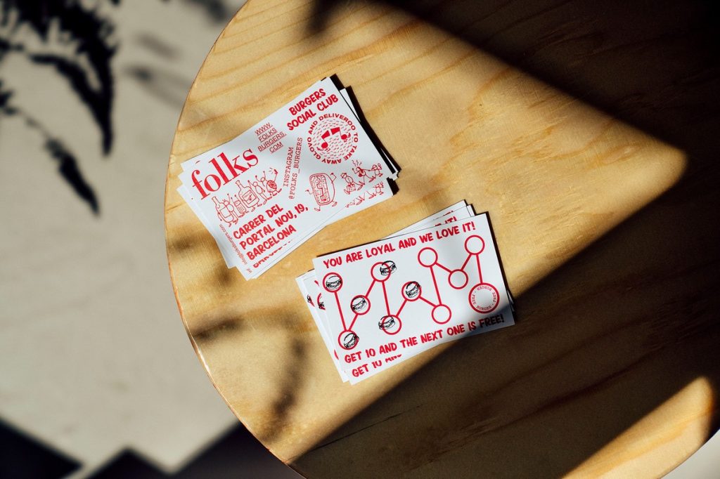
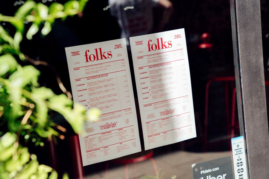
Folks
The guys at Guud Studio did a great job with Folks, a small fast-food restaurant in Barcelona.
“Its small but delicious menu offers 6 different home-made sandwiches including a vegan option and gluten-free bread. Ingredients are carefully selected and combined looking for international flavours within a local touch. The branding focuses on the feeling of a meeting-place for friends in a fresh, relaxed and a carefree atmosphere.” The branding is stripped back and simple, and is dominated by a strong red. The quirky illustrations, alongside the hand-drawn typography, really tie the brand together to make it cool and edgy, which makes the restaurant look like the relaxed & care-free environment it aspires to be.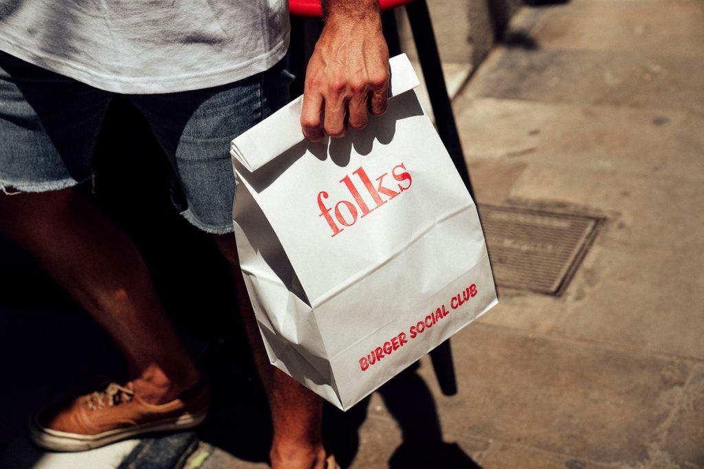
 See the full case study here
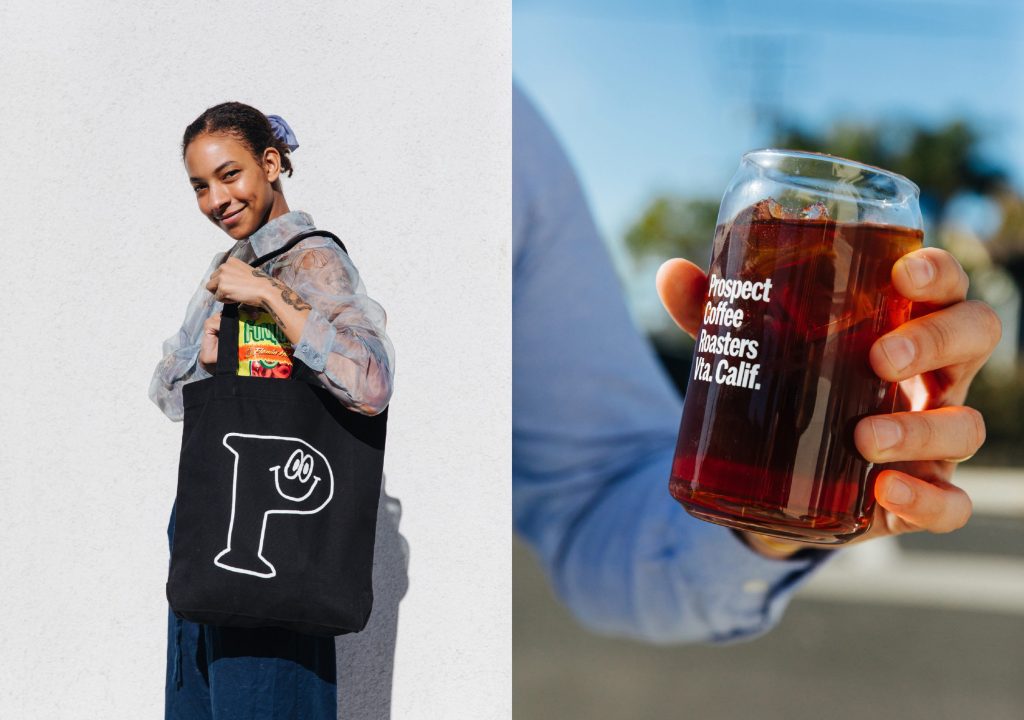
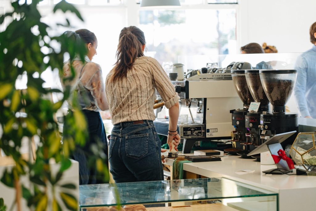
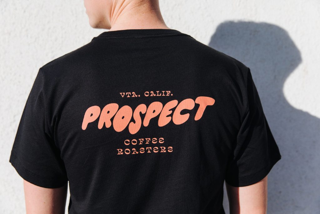
Prospect Coffee Roasters
Prospect a family-owned speciality coffee roasting and retail company based in Ventura, California. They take an intentionally straightforward approach to sourcing their coffee, often partnering with small farms who pay a premium for coffee and reinvest into their land and neighbouring communities, which is great to see.
“To add dimension and tone we worked up a series of loose illustrations that eventually became a relaxed and welcoming thread throughout. They’re a kind of riff on how we imagine the Californian coffee experience. Pretty chill and super friendly.“ Alter are behind this design, they use some bold & interesting typefaces that stand out from the crowd. This alongside their chilled out illustrations gives the brand a laid-back feel, that totally reflects the vibes of California. We love it!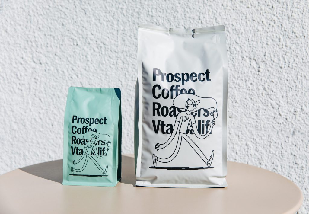
 See the full case study here
This is too many words. I would like to leave
↙ Back to ThoughtsWildish & Co. Featured in Creative Boom
First published on Creative Boom – see full article Wildish & Co designs new campaign and branding for charity Toilet Twinning Since 2010, Toilet Twinning has been an international non-profit that funds global water, sanitation, and hygiene (WASH) programmes run by Tearfund – a Christian charity that partners with churches in over 50 of the … Wildish & Co. Featured in Creative Boom
What can brands learn from the horror genre?
Last week, I went to watch A24’s Heretic – which left me drenched in sweat, I’ll let you decide if you take that as a positive recommendation, or not. It got me thinking about horror as a genre and how it has, is or could influence its neighbouring creative industries. I did a bit of … What can brands learn from the horror genre?